When it comes to converting website visitors into customers of your brand, there are a lot of visual strategies you can implement to boost your chances of successfully making a sale. However, if you consult the data on how web users interact with sites, you’ll see that there’s one area you must pay special attention to. And that’s the website header, to which internet users dedicate 57% of their page-viewing time.
As the topmost section of your site or landing page, usually consisting of a navigation menu, a hero section, and potentially a few banners, a good website header should engage prospects with its content and inspire them to convert with its well-worded CTAs. But that’s not all. It must also leave a positive first impression on first-time web visitors, communicate your brand’s dependability and commitment to delivering high-quality customer experiences, and present your solutions in a way that makes buying a no-brainer decision.
So, if you’re ready to do what it takes to maximize your site’s conversion potential, here are the top tips for designing an effective website header that sells.
Employ Strong Visual Branding
While it’s not the first thing business owners consider when thinking of good design, visual branding is still the ideal starting point for designing a high-converting website header.
After all, web visitors form first impressions about brands within milliseconds of landing on a website. And while a blink of an eye may not allow them to conduct a complete survey of all the elements displayed in the first screenful, it is sufficient to inform them whether they’ve arrived at the right place for their intention.
So, if you’re looking for a single web design strategy that can take your website header from “meh” to “wow,” prioritize developing a look that reflects everything your brand stands for.
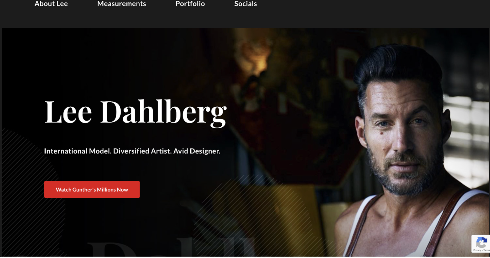
For instance, “Lee.CFD” is a portfolio website dedicated to showcasing the diverse talents and accomplishments of Lee Dahlberg, a prominent model and successful business owner. To visually establish its identity as an authoritative source on Lee Dahlberg’s career and achievements, the website strategically incorporates elements that resonate with its target audience – fashion enthusiasts, potential clients, and industry professionals.
Another example can be a stock market news site like MarketBeat, which operates in the finance world, should try to do everything to visually establish its identity as a relevant source of financial and investing data. So, if you look at the brand’s hero section, you’ll see it utilizes plenty of stock market-inspired elements to appeal to its target audience. From the ticker tape at the top of the page to the navigation menu pared down to the essentials to the news stories showing the latest finance headlines, this business does everything it can to position itself as an authority in the world of investing.
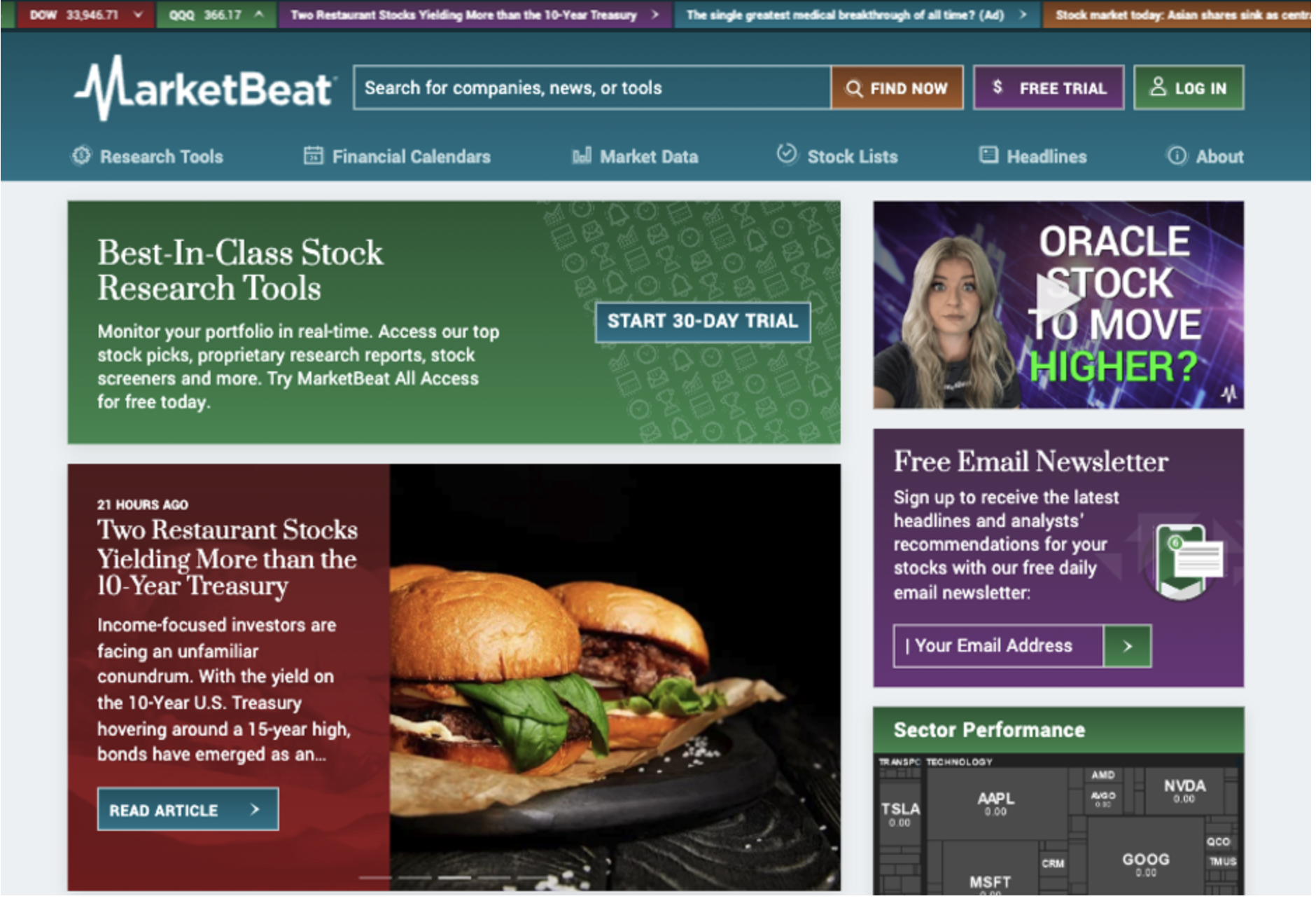
Source: marketbeat.com
Compose a Hard-Hitting USP
The second design tactic that will help you turn your website header into a conversion-boosting powerhouse is to compose a hard-hitting USP, then find the best way to make it appeal to your audience.
If you look at consumer behavior, you’ll find that people tend to have multiple demands when choosing what products to buy. In 2023, shoppers want convenience, affordability, and quality. And they want to know they’re buying from a brand that will deliver an exceptional customer experience.
And, sure, it may not be easy to compose a homepage headline that’s good enough to instantly launch your target audience from the awareness to the purchase stage of the buyer journey. But, by addressing your audience’s pain points and clearly presenting the benefits offered by your solution, you can get more out of the website header section and make it a powerful tool for hooking web visitors and inspiring them to convert.
And remember, winning over your audience with a unique sale proposition isn’t just about copywriting. In fact, it could be argued that how a USP is presented visually is just as impactful as what it says. So, don’t hesitate to explore visually impressive ways to win your prospects over, even if by doing something as simple as using a dynamic heading — like the one on the FOCL homepage.
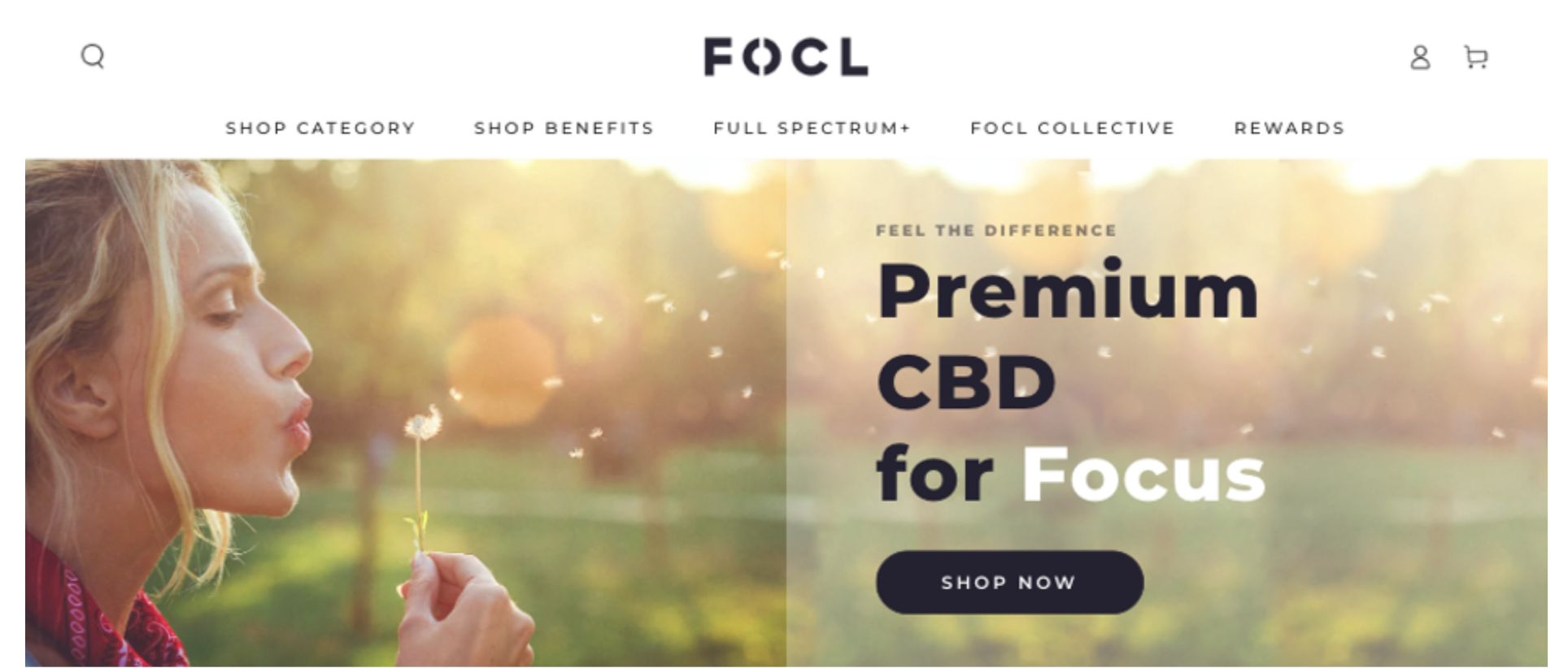
Source: focl.com
Make CTA Buttons Pop
While capturing web visitors’ attention makes for the first step in getting them to become customers of your brand, it’s not enough to drive conversions on its own. So, an effective website header must include at least one convincing, visually emphasized CTA button.
The best way to make this conversion-boosting element pop is by choosing the right color and contrast ratios. This is easy to do by using a color wheel tool and opting for the Complementary color harmony rule.
If you check out the NTX.bond homepage, you’ll see that the design team chose a bright orange color for the CTA button, knowing that it’s the perfect hue to stand out against the blue background.

However, if you prefer a minimalistic approach to website header design, you can still ensure sufficient contrast to guarantee your calls to action stand out. For instance, in the example below from ETQ, the designer chose to save the largest section of the header for the product image. Then, they placed the USP and CTA on the right-hand side, using a pared-down black-and-white look to tie in with the monochromatic hero image they support.
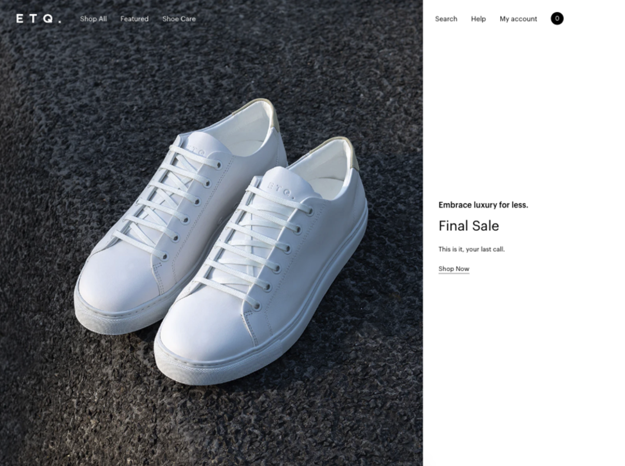
Source: etq-amsterdam.com
Stunning Visuals and Captivating Images
There are numerous reasons to invest in high-quality visuals when designing an effective header.
For one, people are wired in a way that favors visual communication and learning. Images and illustrations have the power to convey (even complex) information without forcing web visitors to read through too much text and risk losing their attention.
Secondly, research shows that pictures have tremendous sales-inspiring potential. According to Google, 50% of online buyers make purchasing decisions based on images.
Thirdly, the more engaging a visual is, the greater its potential for inspiring conversions. Dynamic visual formats are some of the most powerful tools designers can use to inspire consumer action. Essentially, swapping header images for header videos promises next-level returns.
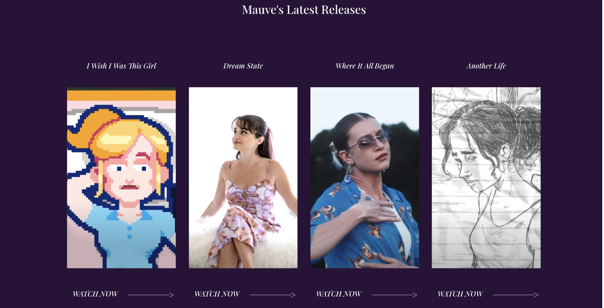
As you browse for inspiration on how to design an effective website header, look to brands like Muuto or check out portfolios like Mauve-music.cfd. Both these websites utilize images to their fullest potential.
Source: muuto.com
It’s also worth mentioning that videos are particularly effective in the header section of SaaS websites. According to Wyzowl, website videos are effective at convincing consumers to buy in as many as 89% of cases. They offer the opportunity for up-and-coming businesses to explain their complex solutions to potential buyers and subscribers.
For instance, SaaS brand Pleo enhanced its website header with an explainer video. And knowing that most of Pleo’s target audience needs a short introduction to business expense management software, the 40-second video is the perfect way to communicate all the benefits the solution offers without overwhelming visitors in the early stages of the buyer’s journey.
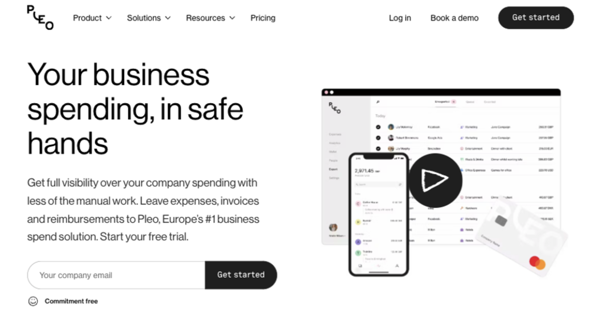
Source: pleo.io
Highlight Conversion-Inspiring Elements
Lastly, when it comes to the design strategies that will allow you to create a website header that engages and converts your audience, don’t forget all the small details that work to nudge your audience toward the lower stages of the sales funnel.
For example, knowing that brand trust plays a significant role in converting clients, explore ways to emphasize information that testifies to your brand’s dependability. This could be your business’s Google rating. You could show off a list of your most successful clients. Or, you could do something along the lines of Startup Resources, a business that highlights the number of entrepreneurs subscribed to its weekly curated newsletter delivering startup tools and resources straight to their inbox.
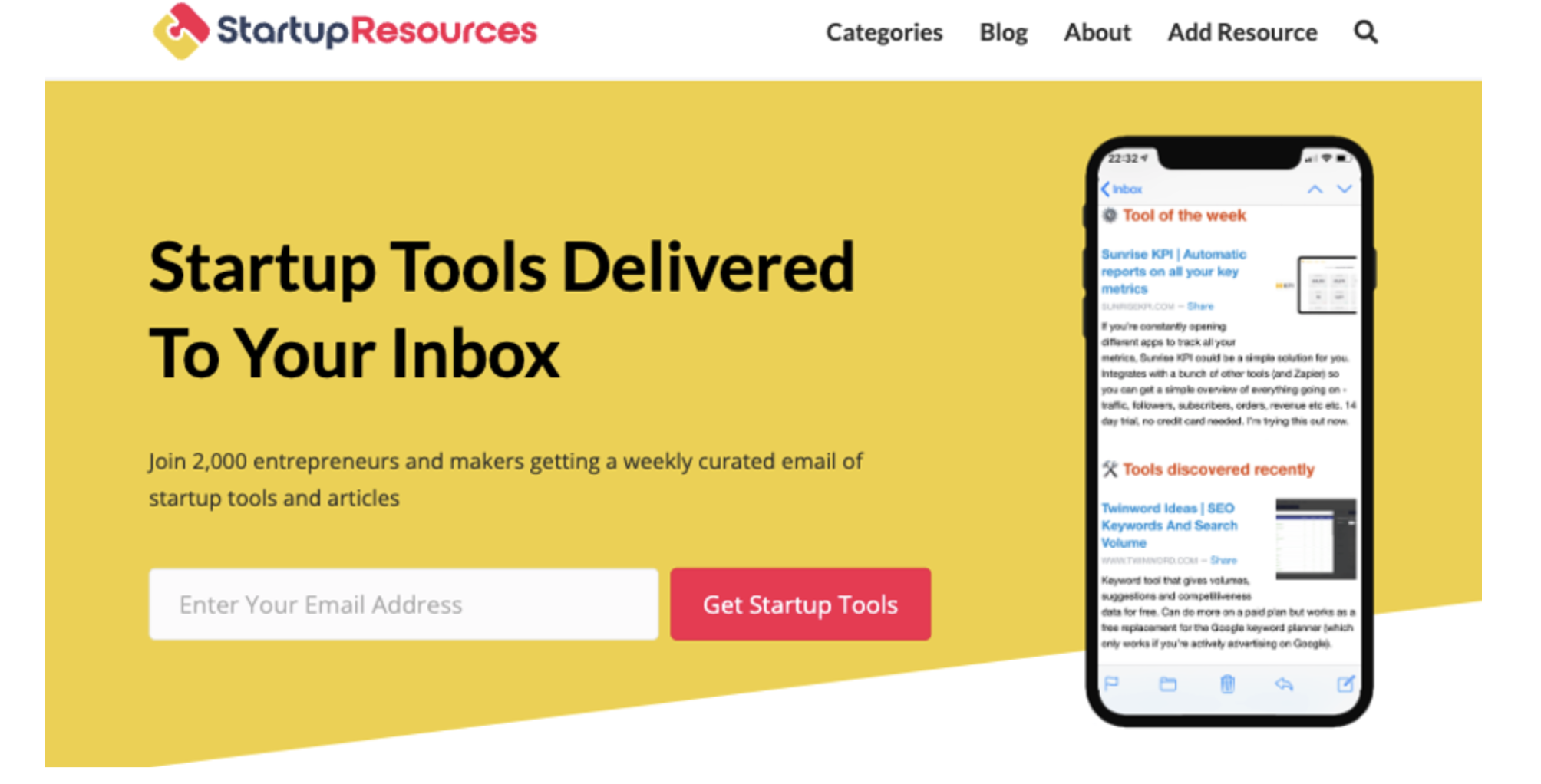
Source: startupresources.io
It’s also a good idea to enhance the first screenful of your website with contact information or widgets. These will go a long way in proving to your audience that your brand cares about delivering a positive customer experience.
For example, you can check out the Hive homepage, which features a dedicated “Contact Sales” CTA button in the top right corner. Or, for even better results, implement a chatbot feature on your website and ensure it offers visitors a helpful and personalized experience to effectively guide prospects through their shopping journey.
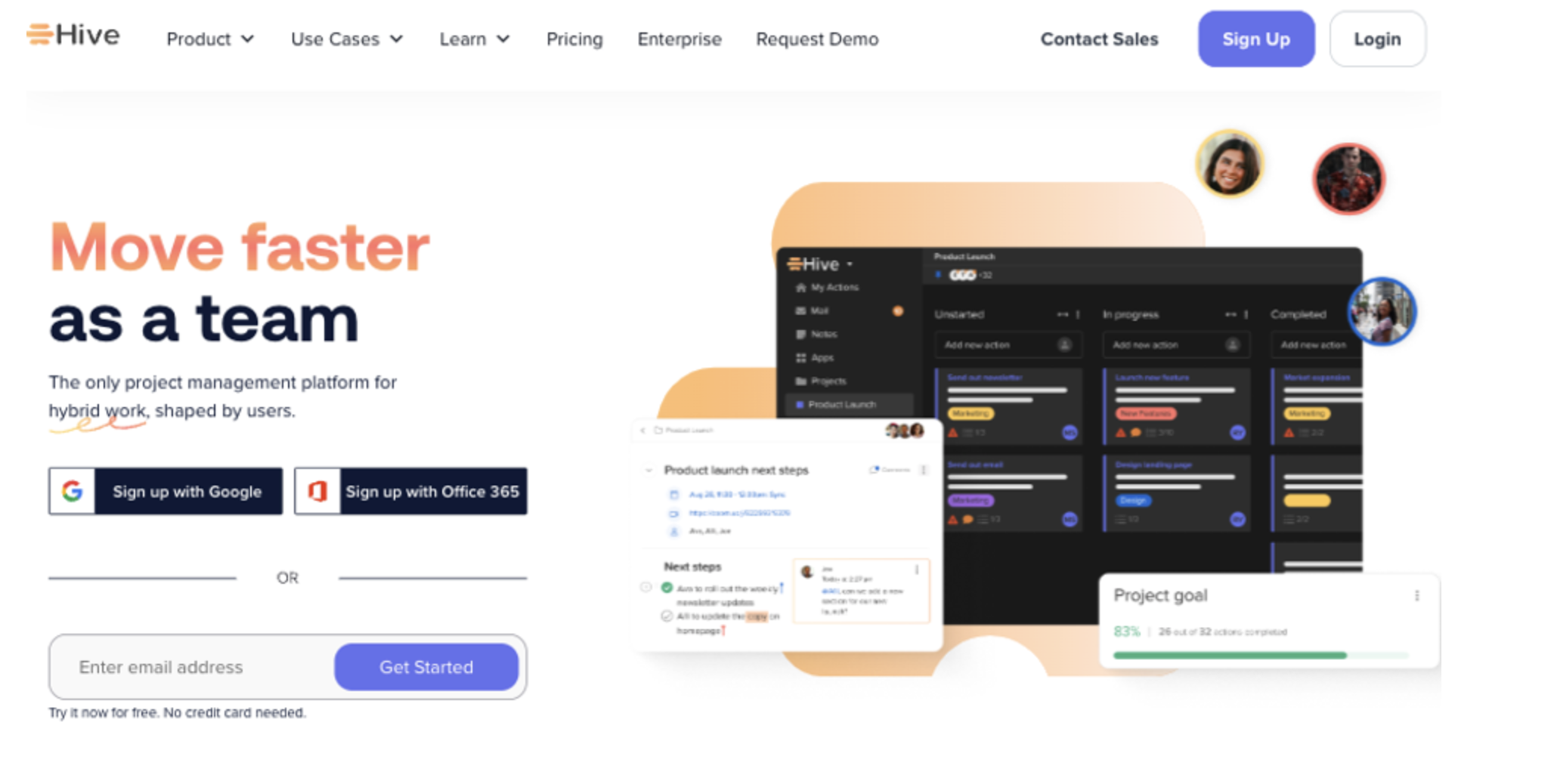
Source: hive.com
Finally, don’t forget to support the main elements with additional value propositions that will thrill your target audience. Non-intrusive messages and popups — like the banner at the top of the Tatcha homepage — can be an excellent way to communicate a benefit your prospects care about (like a discount or free shipping), maximizing the conversion potential of your homepage.
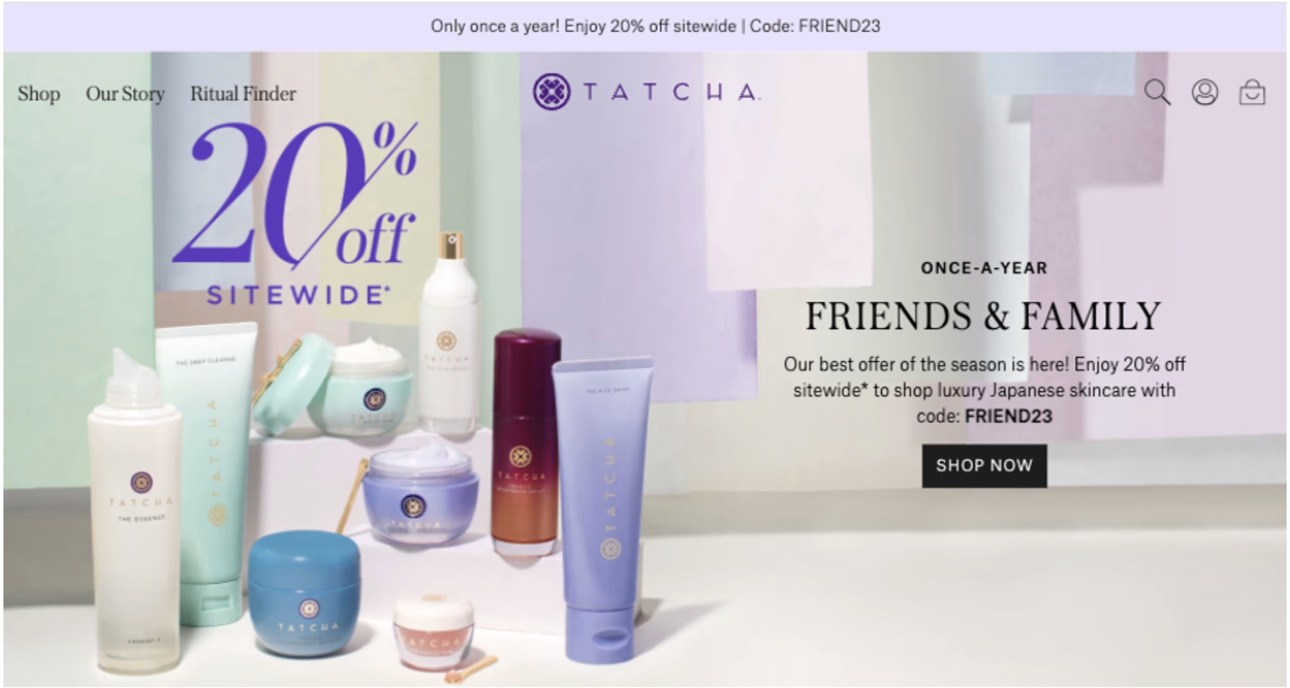
Source: tatcha.com
In Closing
There you have it, the must-follow tips for designing a convincing website header. As you can see, none of these design strategies require you to reinvent the wheel. On the contrary, they all promise exceptional outcomes as long as you get the basics right and focus the topmost section of your website on communicating value.
Of course, if you want to take things even further and achieve above-average conversion rates on your homepage, it’s important to test your site’s efficacy continually. Furthermore, pay attention to its technical performance. And most importantly, listen to your prospects to gain the insights needed to optimize your visuals, copy, and products.
Author Bio

Natasha is a digital marketer and writer who has been working for and collaborating with individual clients and companies of all sizes for over a decade.