
Landing page design plays a vital role in conversion rate optimization. No matter the quality of your copy, if your pages are dull and anything but memorable, chances are you will rarely convince your visitors to turn into paying customers.
How can you cleverly use the visual elements of a page to improve your conversion rates and grow your business? Here are nine hacks to help you get started.
1. Tell A Compelling Story
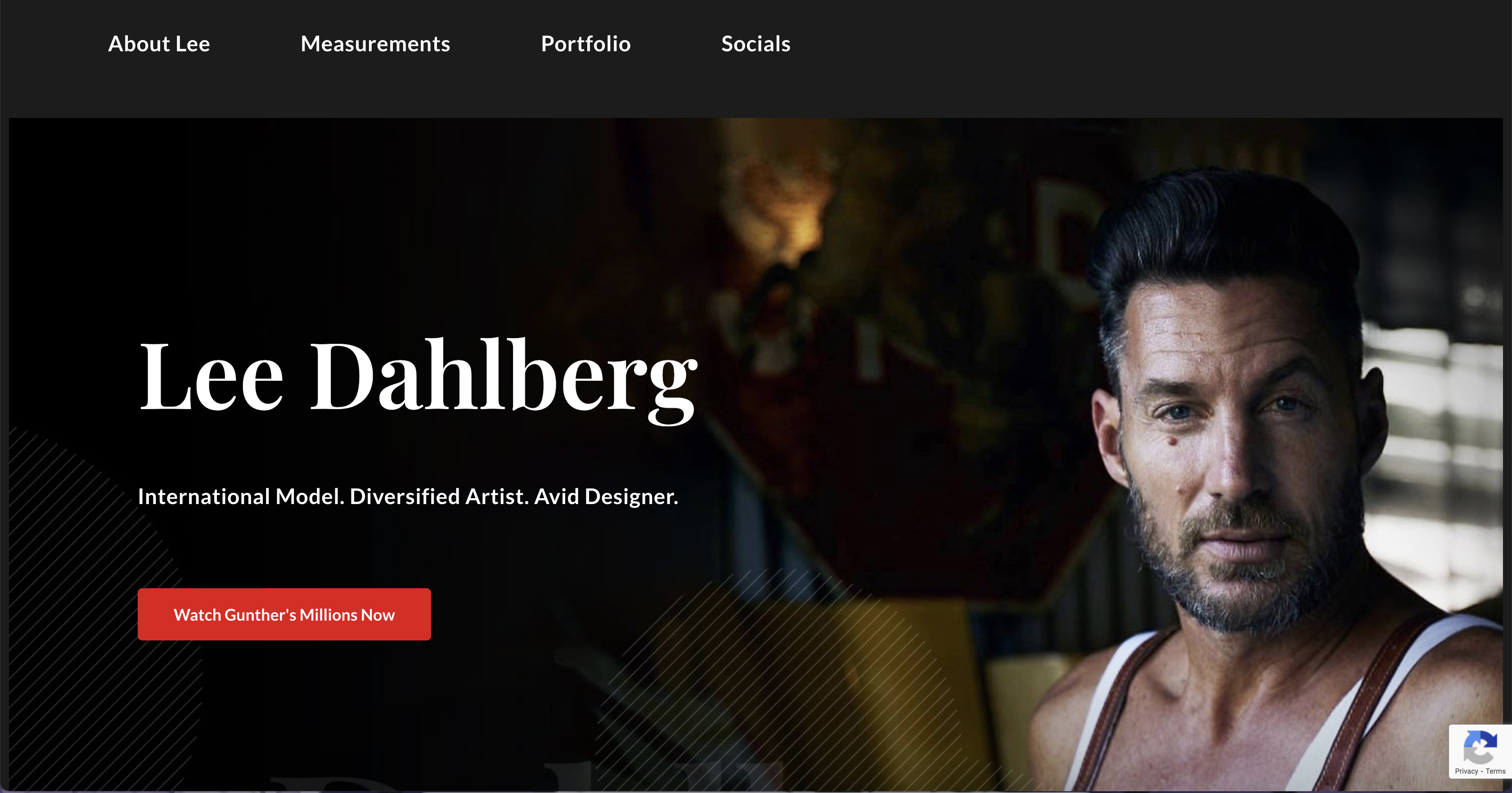
To create a landing page that truly resonates with your audience, you need to tell a story that captures their attention and keeps them engaged. This can be particularly effective if you’re promoting a personal brand or individual. Take a look at www.lee.cfd. The landing page uses elements of Lee’s story, such as his background, achievements, or unique experiences, to craft a narrative that draws visitors in and encourages them to learn more. By highlighting Lee’s work in the Netflix documentary and his successful business ventures, he showcases his expertise and authority in the industry, which can help build trust with his potential collaborators.
2. Include User-Generated Content
The best visuals you can include on a landing page are often the photos and videos your customers create. They are much more natural than anything you could shoot. Since they come from various people, they will provide plenty of different angles and stories.
When utilizing UGC, ensure your customers know they will be featured on your website. It’s a good idea to set up a social media hashtag to ease your access to this type of content and clarify what you collect images for. Or, you can ask each person individually if you can borrow their content.
ShopSolarKits does a great job with its UGC element. They show customer images alongside customer reviews and make it much easier for leads to visualize how their project could turn out.
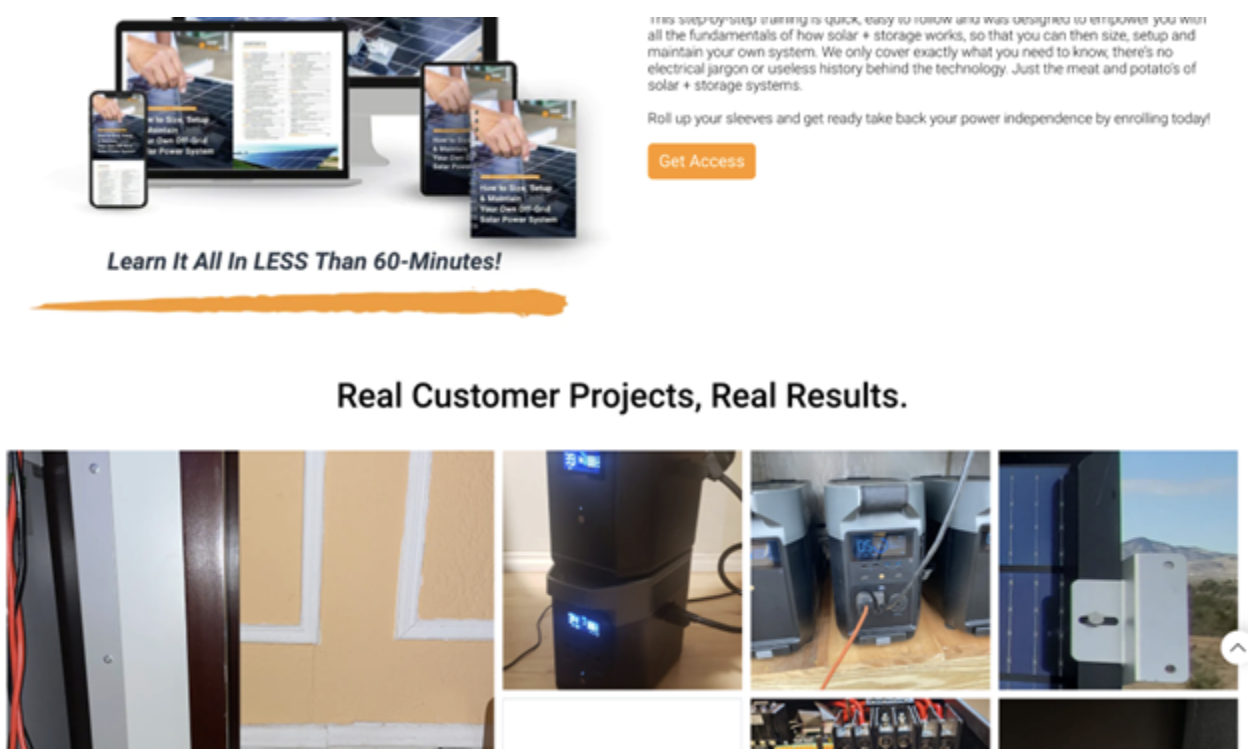
Source: shopsolarkits.com
Given the complexity of their product, this helps even the less handy among their audience feel confident they can set up their system.
3. Leave Plenty of White Space
The use of white space plays a vital role in the visual design of your landing pages. When you fail to utilize it correctly, you instantly make a page more difficult to digest, thus reducing time on the page and the likelihood of a conversion.
White space will draw the focus and attention of your audience where you need it to be. It will direct their gaze at the elements you need them to consider in the order you want them to be considered. It also provides a useful respite between chunks of information, helping readers digest everything they have just been exposed to.
Remember that white space does not need to be white. It can be as colourful as you like (within reason) and still achieve the same effect. Look at the Vetter homepage, which uses shades of gray and blue as negative space with great products. The page is not dull but remains logically organized and easy to take in.
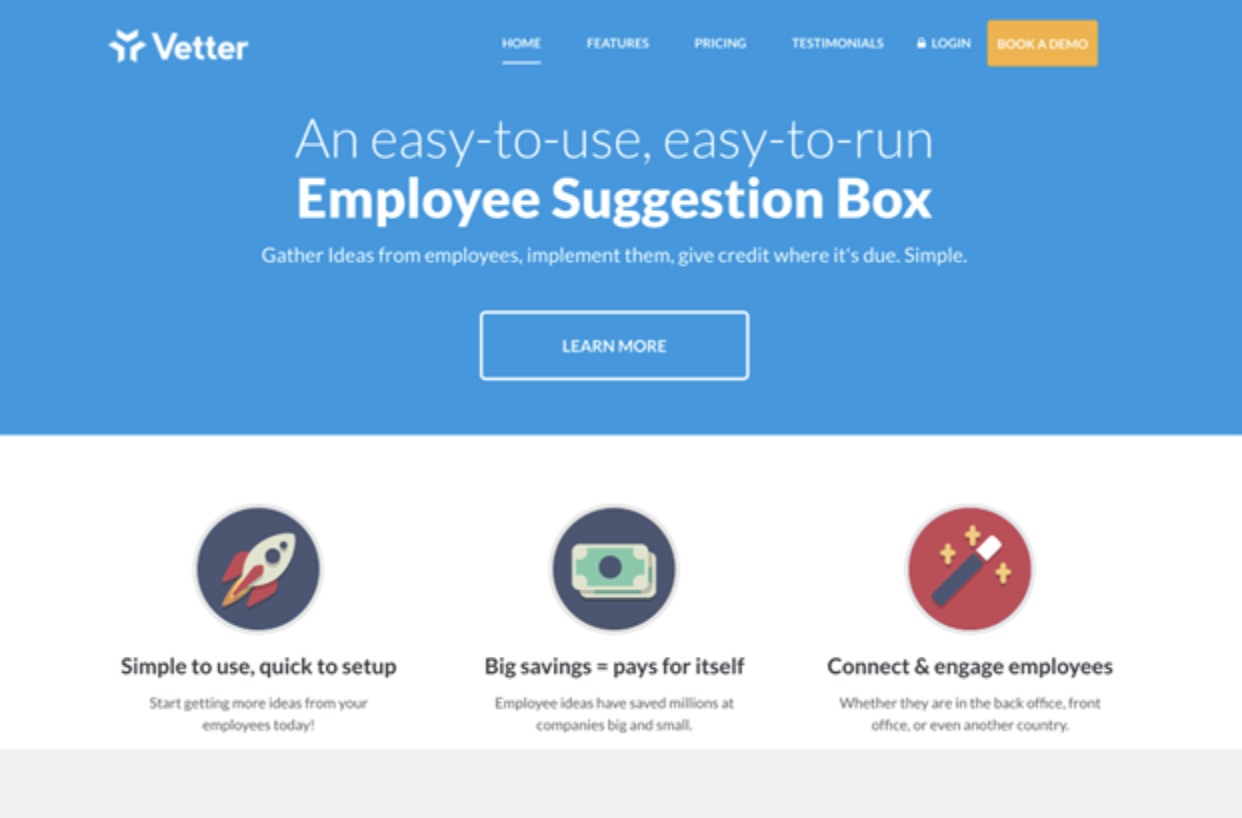
Source: getvetter.com
4. Add a Video
Boosting engagement and time on the page is a great way to increase conversions. The more visitors spend time with your brand, the more likely they will form a connection and decide to opt for a transaction.
The obvious content format to reach for with this in mind is video. It’s a great way to add another layer of meaning and messaging to your pages. Plus, it will help you add a bit of human touch.
You can film various types of videos: explainers, guides, testimonials, behind-the-scenes, etc. The purpose and goal of the video should naturally match the landing page. You don’t want it to look like the video has just popped out of nowhere and has no particular connection to the rest of the page.
Take a look at Bay Alarm Medical. Their homepage is video-heavy, which is great for their target audience, who are most likely elderly and would prefer to watch and listen rather than read. They also show the product and its benefits from various angles. They let customers and experts speak about it and explain why this product is important.
5. Brand Your Product
Let’s not forget how important the visuals of your products are. The more you can brand them and tie them into your overarching marketing and sales strategy, the more memorable they will be.
If you cannot brand your product, you should at least aim to brand your packaging. For example, order boxes engraved with your logo if you sell mugs. Ensure you feature said packaging on your website to boost brand value and recognizability.
Check out Vivion, which branded all its packaging and prominently displayed it on its homepage. It promotes cohesion and makes them stand out among their competitors.
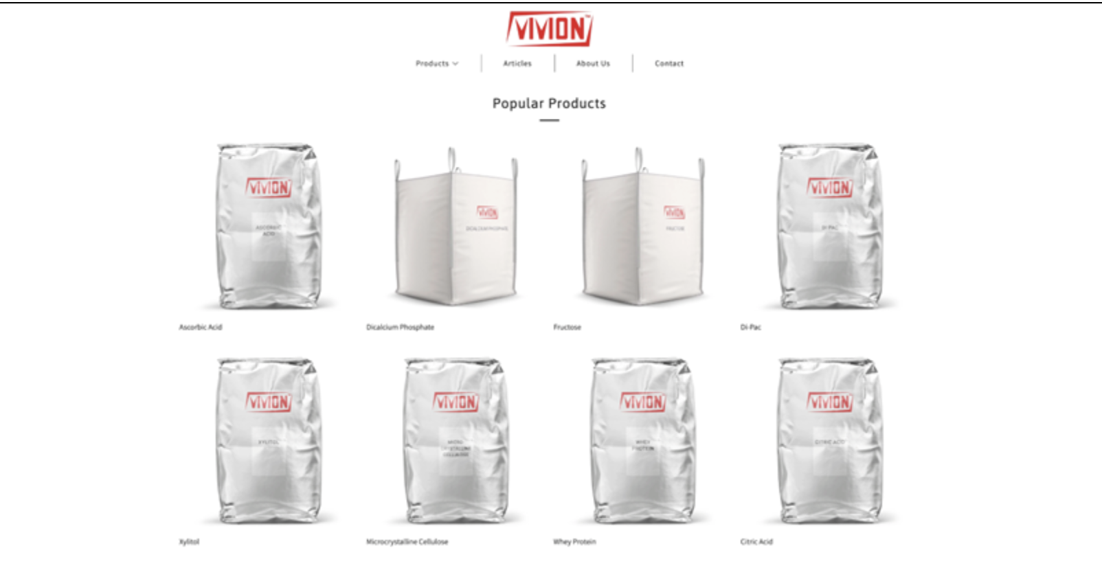
Source: vivion.com
6. Show the Product
Speaking of products, you should also feature them on your landing pages (even when the landing page in question is not just about showcasing that one product).
A lot of your audience will land on your homepage. They shouldn’t have to browse your product pages or category pages to get a glimpse of the product they are interested in. Instead, they should be exposed to it as early on as possible. The more action and effort you demand from your leads, the higher the chances they will give up and leave. The simpler you can make it for them, the better.
Take a look at Mannequin Mall. They feature a “bestsellers” section on their homepage, which instantly tells customers whether they are in the right place, i.e., if they will find the type of dummy they are looking for here.
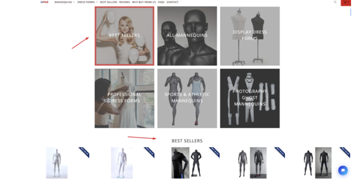
Source: mannequinmall.com
You don’t have to display all or even most of your products: consider your sales funnel and feature the items you know shoppers are most likely to be interested in.
7. Choose an Unusual Color
Sometimes the simplest design hacks work the best. Instead of trying to come up with a completely new layout or shoot videos and images that are unlike anything your competitors have done, you can make yourself more memorable by choosing an unusual colour for your landing pages.
[Text Wrapping Break]This does not mean you should go neon or choose something garish. All you need to do is select a hue that is slightly different from what most brands go for in your niche. Find a shade with marginally more greens or browns if blue is popular.
Take a look at Career Sidekick. They’ve done a great job with their choice of colour, which remains professional and evokes a sense of professionalism while still being unusual enough to help you remember them.
8. Illustrate a Concept
Your landing pages will be even more memorable and conversion-oriented if you can use visuals to illustrate the benefits of your product or service. This is especially important for service-based businesses, who may have a difficult time conveying their benefits without an extensive amount of words.
Let’s take a look at an example to understand this idea better. WeRecycle has a clever illustration on its main landing page, which explains what they are all about and what its service looks like. It’s a much more attractive solution than had they chosen to feature images of actual garbage.

Source: werecycle.ch
This is a great way to communicate additional value via your visuals instead of forcing leads to read through your copy.
9. Display Data Clearly
How you display complex information and data can significantly cripple or boost your conversion rates. The more confused your visitors are, the less likely they are to make an effort to understand what you are trying to say.
Figures and statistics are thus best displayed in charts and graphs. They should never be left in written format alone. While you should certainly add some copy explaining the significance of said data, you need to ensure it’s displayed easily.
Look at this Ahrefs page, which compiles all of their big data. It does a fantastic job of detailing why it’s important and how it impacts the quality of its product. Look at the font size and colours and how they draw the eye to the most important numbers.
The fact that the page is interactive is another huge bonus, so you can also consider creating interactive charts.
10. Put a Face on It
Finally, add some human touch to your landing pages to increase your conversion rates. Like with UGC, featuring your employees, customers, or even stock photos of humans will help you form a deeper connection with your audience and make you much more relatable.
When selecting the images you want to feature, aim to make them as diverse as possible while keeping them similar to your target audience. For example, if you know a lot of your audience works from home, feature photos of people doing the same to add another layer of reliability.
Shopify does a great job in this department. While none of their homepage content is user-generated, they feature their customers and tell their stories. They have also nailed the atmosphere of the photos: light, bright, and positive, which instantly makes you think the brand can do something good for your business too.
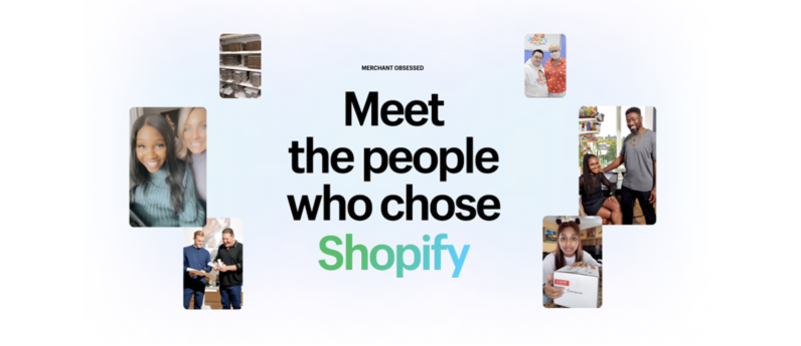
Source: shopify.com
Wrapping Up
Before applying any of these visual hacks to your landing pages, carefully consider what you already have in place and how it’s working for you. You may find that you only need to make slight tweaks. If a more extensive remodel is in order, don’t forget to create several versions and A/B test them until you find the best one.
Author Bio

Natasha is a digital marketer and writer who has been working for and collaborating with individual clients and companies of all sizes for over a decade.