Mobile-Friendly E-commerce: What Is It And Why Is It Important?
Is your online store reaching everyone it could, or are you losing potential customers because your website doesn’t look right on their phones? Making your eCommerce site work well on mobile devices is now essential, not just a nice extra.
When you start selling online, getting the hang of mobile optimization is a big deal. It’s all about making sure you grab and keep a broad audience from the get-go.
Let’s walk you through how to make your eCommerce site friendlier for mobile users. We’ll cover the basics, from making your site faster to designing it for finger taps and swipes to make shopping with you a better experience.
What Is Mobile vs. Web eCommerce?
Mobile eCommerce, or mCommerce for short, is the go-to for shopping via smartphones and tablets. It’s crafted with busy, on-the-go individuals in mind, ensuring everything from browsing to checkout is a breeze, quick, and looks sleek on smaller screens.
This makes it ideal for those who want to seamlessly integrate shopping into their schedules, perhaps in between virtual event sessions or while multitasking on other digital platforms.
On the flip side, web eCommerce takes the stage on the bigger screens of desktops and laptops. It spreads out more, giving you a broad canvas to explore products, often with more complex navigation. This is preferred by those who like taking their time shopping on a larger display.
Here’s a breakdown of how the Golf Cart Tire Supply mobile site excels in mCommerce for its golf cart lift kit listings:
- Product display: The site shows products in a simple grid. The images are clear and fit well on mobile screens. This makes it easy for shoppers to look around without having to zoom in.
- Pricing & discounts: Prices are bold and easy to see. Discounts stand out, showing you where you can save money. This helps shoppers decide to buy faster.
- Star ratings: Under each product, there are star ratings. These let you quickly see how good the product is and how popular it is. It’s a fast way to help you choose.
- Call to action (CTA): A big “Get $10 Off” sign is at the bottom of the screen. It grabs your attention and encourages you to keep looking or to buy.
- Navigation & search: A menu, search icon, and cart icon make moving around the site simple. You can easily find what you’re looking for, switch sections, or check your cart.
- Contact information: There’s a phone number at the top. It’s easy to find if you need help. This makes shoppers feel more secure and more likely to buy.
With these targeted features, the Golf Cart Tire Supply mobile site ensures that shopping for mobile users is straightforward, promoting sales and customer satisfaction in the fast-paced realm of mCommerce.

The Importance Of Mobile Web Design
Mobile web designIt ensures your website looks good on mobile devices and is easy to use. This means quick load times, readable text, and buttons big enough for fingers to tap without hitting something else.
Imagine you’re on your phone, trying to buy something online, but the website is slow, the text is too small, and the buttons are hard to click. Frustrating, right? That’s exactly why mobile web design is important.
Why is this so crucial for eCommerce? Simple. More and more people are shopping on their phones. If your website isn’t designed for mobile, you’re likely losing customers to competitors who optimized their sites for mobile use.
A mobile-friendly website makes shopping convenient for your customers, no matter where or what device they use. It’s about giving them a smooth and enjoyable shopping experience that encourages them to complete their purchase and return for more.
Moreover, search engines like Google favor mobile-friendly websites. This means that by optimizing your site for mobile, you’re enhancing user experience and your site’s visibility in search results. This can bring in more traffic and, ultimately, more sales.
How Is User Behavior Different On Mobile eCommerce Sites Compared To Desktop?
Mobile and desktop shoppers act differently. So, websites need unique designs and features for each. Let’s break it down simply.
| Aspect | Mobile Users | Desktop Users |
| Speed & Convenience | Expect instant loading and easy navigation. | More patient with load times and complex navigation. |
| Interaction | Use touch; prefer big, easy-to-tap buttons. | Use a mouse; it can handle smaller clicks and detailed navigation. |
| Content Consumption | Like quick, clear info; scan for key points. | Willing to read through more detailed content. |
| Shopping Path | Often research and compare on the go. | Likely to do extensive research in one session before buying. |
Top 10 Benefits Of A Mobile-Friendly eCommerce Website
Here, we dive into the top benefits of a mobile-friendly eCommerce website, which underscore why adapting your online presence for mobile users is beneficial and essential for staying competitive in today’s market.
1. Responsive Design
The cornerstone of a mobile-friendly website, responsive design ensures your site looks and functions perfectly across all devices. It dynamically adjusts layout, images, and navigation based on the device, providing a seamless experience for users.
This adaptability enhances user satisfaction and supports SEO efforts, as Google prioritizes mobile-friendly websites in search rankings.
2. Search Engine-Friendly Design
A mobile-optimized site boosts your visibility online. Google has moved to mobile-first indexing, meaning it predominantly uses the mobile version of content for indexing and ranking. Websites optimized for mobile enjoy better positions in search results, driving more traffic.
3. Increased Mobile Traffic
With over half of all web traffic from mobile devices, a mobile-friendly site taps into a larger audience pool. Sites optimized for mobile can see a significant uptick in visitors, expanding your reach and potential customer base.
4. Easy Navigation by Using Just Your Thumb
Mobile users often navigate with just one hand. Designing your site with thumb-friendly navigation in mind — like placing key navigation buttons within easy reach — can vastly improve the user experience, keeping users engaged and reducing bounce rates.
5. Omnichannel Shopping Experience
Today’s consumers expect a seamless shopping experience across all channels and devices. A mobile-friendly site is a key part of an omnichannel strategy, allowing customers to switch between devices without losing progress or restarting their shopping journey.
This approach enhances user satisfaction and supports inventory and asset management across various platforms. For instance, integrating a solution like EZOfficeInventory can streamline the management of assets and inventory, ensuring that real-time data and insights support your omnichannel strategy.
This ensures that whether a customer interacts with your brand online from a mobile device or in a physical store, the experience is cohesive, and your inventory is accurately reflected, making a mobile-friendly site an integral component of your omnichannel approach.
6. Mobile Devices Are Tools For Product Research
A staggering 79% of smartphone users have purchased online using their mobile device in the last 6 months. Optimizing your site for mobile caters to the growing number of users who research products on the go, increasing the chances they’ll choose your site for their purchase.
7. Custom Search By Using Audio Search On Smartphones
Voice search is rising, with more consumers using voice assistants for online queries. A mobile-optimized site that supports audio search can provide a more convenient, hands-free shopping experience, catering to this growing trend.
8. Better Social Media Engagement
Social media platforms are predominantly accessed via mobile devices. A mobile-friendly eCommerce site makes it easier for users to share your products and content on social media, enhancing your brand’s visibility and engagement.
For a deeper understanding of how social media algorithms prioritize and distribute content, consider exploring resources that break down these mechanisms.
An insightful example is Flick’s detailed analysis of the Threads algorithm, available at Flick’s Blog on Threads Algorithm. By understanding these dynamics, you can optimize your content for better performance on social media, further enhancing engagement through a mobile-optimized site.
9. Enhanced Brand Perception
A mobile-friendly site signals that your brand values and understands its customers’ needs. It shows you’re committed to providing a convenient, modern shopping experience, which can boost customer loyalty and advocacy.
10. Faster Loading Times
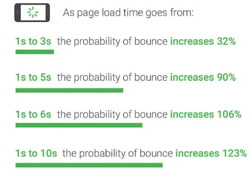
Mobile users expect quick information. Sites optimized for mobile typically load faster, which is crucial for holding users’ attention and reducing bounce rates. Faster loading times also contribute to better search engine rankings, creating a virtuous cycle of increased visibility and traffic.
Incorporating these elements into your eCommerce strategy not only meets the immediate needs of your mobile users but sets your brand up for long-term success by aligning with evolving consumer behaviors and technological advancements.
Now, transition into practical advice and examples to help you understand how to implement or improve mobile-friendliness:
Mobile eCommerce: 7 Best Mobile Practices
Each practice is designed to cater to the mobile user’s need for speed, simplicity, and efficiency, from image optimization to navigation tweaks.
I. Ensure Images & Video Are Optimized for Mobile
High-resolution images and videos can slow down your page load times, which is a big no-no for mobile users who expect quick access.
How to do it: Compress images and videos without losing quality. Consider using tools like Adobe Photoshop for images and HandBrake for videos. Also, adopt responsive images that adjust to screen size using HTML’s attribute. Here’s how:
- Add “srcset” to your image tag in HTML.
- List different image sizes and specify when to use each.
- The browser picks the best fit for the screen.
Easy, right? Your images will now adjust to any device.
II. Avoid Usage Of Flash & Too Much Pop-Up Ads
Flash isn’t supported on most mobile devices, and pop-ups can be annoying and disruptive on small screens.
How to do it: Use HTML5 instead of Flash for animations or interactive content. Limit pop-up ads or make sure they’re easy to close on a mobile device.
III. Optimize Menu Navigation
Mobile screens offer limited space, and cluttered menus can confuse users.
How to do it: Simplify your menu with a dropdown or “hamburger” style that expands. Highlight critical sections for easy access and use clear, concise labels.
For instance, the Ultimate Meal Plans website utilizes a hamburger menu effectively. You’ll find this menu icon at the mobile screen’s top right corner— three horizontal lines resembling a hamburger.
Tapping this icon reveals the full menu of the website, organizing content into navigable sections.
This keeps the homepage clean and uncluttered, allowing users to easily find and access sections like the meal plan generator, FAQs, and support options without overwhelming them with information all at once. It’s an excellent way to present a complex site on a small screen, ensuring that even first-time visitors can easily navigate it.

IV. Structuring Product Categories
Well-structured categories make it easier for users to find what they’re looking for.

How to do it: Group products logically and consider user feedback to understand how they search for items. Use broad categories with filters to narrow down options.
V. Include a Search Function

A search function is important for users who know what they want and wish to find it quickly.
How to do it: Place a prominent search bar at the top of your site. Use autocomplete suggestions to help users find products even if they misspell terms.
VI. Make Contact Information Easily Accessible
Customers on mobile devices may want quick answers to questions or need to contact customer service.
How to do it: Include a dedicated contact section or link in your site’s footer or menu. Consider adding a live chat feature that’s easily accessible on every page. Use a WordPress chat plugin like Chaty. Chaty lets you add chat buttons for WhatsApp and Facebook Messenger right on your site, making it super simple for customers to get in touch.
VII. Improve Readability On Mobile Devices
Mobile screens are smaller, so readability is crucial. The text must be easy to read without zooming.
How to Do It: Use larger font sizes and contrasted text colors. Break up text into shorter paragraphs. Make sure that buttons and links are easy to tap.
FOCL’s website exemplifies excellent readability for mobile users when it comes to their female libido gummies.
Consider the text displayed on the product page: It’s crisp, clear, and sufficiently large, ensuring it’s legible on even the smallest screens. This is a key principle in mobile design—text must be readable at a glance without zooming in.

Moreover, they mastered the use of contrast. The dark text pops against the light background, which isn’t just visually appealing—it’s strategic. It guides the eye naturally through the product’s key benefits, which are neatly broken down into bullet points.
What Are The Essential Features For A Mobile Site To Be Compatible With Various Mobile Devices?
Focusing on the technical specifications and elements crucial for a mobile site’s accessibility and usability across all devices, here’s a simplified list:
- Clear and clickable call-to-action buttons.
- Easily accessible contact information for user convenience.
- An intuitive search feature with auto-complete for ease of use.
- Responsive design to ensure the site adjusts to any screen size.
- Avoidance of Flash in favor of HTML5 for better device compatibility.
- Readable text without needing to zoom in, with appropriate font sizes.
- SSL certificate to secure the site with HTTPS for user data protection.
- Minimal use of pop-ups, and if used, ensuring they are easily dismissible
- Touch-friendly navigation, including easily adaptable menus and buttons.
- Media content optimized for mobile, including scalable images and videos.
- Fast loading times using optimization techniques like image compression.
- Cross-browser compatibility to ensure the site works smoothly across different mobile browsers.
These elements form the backbone of a mobile site’s technical setup, ensuring it meets the fundamental requirements for accessibility and usability on various devices.
Checking Your Website Friendliness With Tools Like Think with Google
Navigating the mobile-friendly waters of today’s internet can seem complex, but thankfully, there are tools designed to simplify this process. One standout tool is “Think with Google’s Test My Site.”
It acts like a health check for your website, assessing its mobile-friendliness, loading times, and overall performance on mobile devices.
Here’s how you can use tools like Think with Google to check and enhance your site’s mobile friendliness:
- Enter your site’s URL: Start typing in your website’s address. It’s as straightforward as it sounds – just like entering a web address in your browser.
- Get your results: Within moments, you’ll receive a score that tells you just how well your site performs on mobile. It looks at speed, user experience, and how your site stacks up against industry standards.
- Detailed breakdown: The beauty of Think with Google is that it doesn’t just give you a score and send you on your way. It breaks down what’s working and what’s not, offering specific insights into areas like image optimization, text readability, and navigation.
- Actionable recommendations: Perhaps the most valuable feature is the list of actionable recommendations Think with Google provides. These aren’t just vague suggestions but tailored advice on how to make your site faster and more user-friendly. For example, it might suggest compressing images to decrease load times or restructuring your menu for easier navigation on small screens.
- Competitive comparison: Want to know how you stack up against competitors? This tool can also give you an insight into how your mobile site performance compares to others in your industry, providing a benchmark to aim for or surpass.
Finding Out Requirements For Your Mobile-Friendly eCommerce Website
This process is crucial, whether you’re launching a new site or aiming to enhance an existing one, as it aligns your business objectives with the expectations of the mobile-first consumer.
A. Understand Your Audience
Start by analyzing your current traffic. Use analytics tools to determine what percentage of your visitors use mobile devices and what types are most common. This data will guide your optimization efforts and help prioritize changes.
B. Set Clear Objectives
Define what you want to achieve with your mobile-friendly site. Is it increased traffic, higher conversion rates, improved search engine rankings, or all of the above? Setting clear objectives will help measure the success of your efforts.
C. Evaluate Current Performance
Utilize mobile testing tools like Google’s Mobile-Friendly Test to understand how your site currently performs on mobile devices. Identify any major issues impacting user experience, such as slow loading times or difficult navigation.
D. Review Content And Design
Content and design play a crucial role in mobile friendliness. Ensure that your content is easily readable on small screens and that your design is responsive. Consider the user’s journey through your site, from initial visit to checkout, and make sure it’s as intuitive as possible.
E. Consider Technical Aspects
Look into the technical elements that affect mobile friendliness, such as site speed, responsive design, and image optimization. PageSpeed Insights can offer specific recommendations for technical improvements.
F. Competitive Analysis
Investigate how your competitors’ sites perform on mobile. This can provide insights into industry standards and reveal areas where your site could stand out with better mobile optimization.
For deeper insights, you could leverage analytics tools that dissect retail performance. For instance, ClicData offers solutions tailored for analyzing retail operations, which you could apply to study mobile trends and behaviors in your market.
By integrating this data-driven approach, you can make smarter marketing, sales, and procurement decisions. To see how analytics can drive competitive advantage, check out ClicData’s insights on retail analytics.
G. Legal & Accessibility Considerations
Ensure your mobile site complies with legal requirements and accessibility standards. This includes considerations for users with disabilities, which can affect aspects of your design and navigation.
H. Plan For Ongoing Optimization
Mobile optimization is not a one-time task but an ongoing process. Technology and user expectations evolve, so plan for regular reviews and updates to your mobile site.
I. Securing Investment for Your Mobile Optimization
To make your eCommerce site mobile-friendly, consider how you’ll fund these enhancements. This is where understanding different investment strategies becomes relevant.
For example, partnering with search fund investors could provide the necessary capital to overhaul your website. By securing this investment, you can finance the technical improvements needed to optimize your mobile eCommerce platform, ensuring it’s fast, responsive, and visually appealing on any device.
Conclusion
In today’s fast-paced online shopping world, having a site that looks good and is easy to use is key. This is especially true for shopping on a mobile phone.
Your mobile eCommerce website needs to impress and make shopping smooth. Whether customers are on their phone or computer, they should enjoy using your site. Choosing responsive web design means you care about making all customers happy, no matter how they visit your site.
Thinking about making a separate mobile site? It’s often better to have one site that works for everyone.
Looking to stand out online? ShortDot can help. They offer short, catchy domains that mix a professional look with a friendly feel. A domain from ShortDot.bond shows you’re serious about leading in mobile commerce. Don’t wait to make your mark online.
Author Bio
Burkhard Berger is the founder of Novum™. He helps innovative B2B companies implement revenue-driven SEO strategies to scale their organic traffic to 1,000,000+ visitors per month. Curious about what your true traffic potential is?

Burkhard Berger
Gravatar: vip@novumhq.com