If your business is looking to drive online conversions, gain insights on customers, or generate high-quality leads – an effective, high-performing landing page can help you achieve these goals.
But, what is a high-performing landing page, and how do you create one?
This guide covers all these questions and more. So, let’s get into it.
The Purpose of Landing Pages
A landing page is a website page displaying a targeted offer in order to attract leads and drive sales. Typically, this standalone page focuses on a single product or service and encourages prospects to perform a certain action.
There are many types of landing page types, including:
- Squeeze pages solely to collect email addresses.
- Click-through landing pages encourage visitors to hit the call-to-action (CTA) button, which then leads them to another landing page displaying pricing or free trials.
- Long-form sales pages leverage longer, more in-depth content to convince and convert visitors.
- Paid advertising / pay-per-click landing pages intended for paid campaigns. These direct paid traffic to a dedicated page after users click on a pay-per-click (PPC) ad.
- Lead capture pages to source a visitor’s information like name, business, email, job title, etc.
-
So, what’s the point of using these targeted pages, and why are they important to businesses?
Simply put, a high-performing landing page removes all distractions, so visitors focus purely on your offer or objective. And this will help move them down the sales pipeline and closer to making a purchase.
Additionally, landing pages help businesses:
- Boost paid search advertisements and campaigns
- Generate high-quality leads
- Secure more data and insights on the target audience
- Improve brand awareness and more.
Getting Started with Landing Pages
Landing pages are generally considered an inexpensive form of advertising, especially when compared to traditional methods. Of course, the cost of developing a landing page depends on a business’s needs and factors like in-house creation vs. outsourcing and organic vs. PPC advertising.
For those looking to create landing pages in-house, consider investing in these resources for the best results:
- Domain extensions (like .icu or .cyou), if you don’t already have a website setup
- Software for creating graphics, website building, and metric tracking
- High-quality images from an in-house photographer or stock photo platform
- Staff with copywriting, content marketing, website building, UX design, and graphic design knowledge.
Now, it may seem like a waste to invest in these resources when one could just create a few landing pages and reuse them as necessary. However, businesses should avoid repurposing the same landing pages for different campaigns and buyer personas.
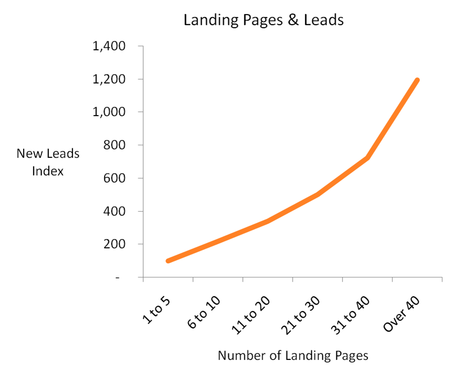
The highest converting pages target a specific audience segment and discuss a niche offer or topic. Businesses that generated over 40 different landing pages saw 12 times more leads than others with only 1-5 landing pages, according to a study. So, it’s important to develop a variety of landing pages.
How to Create a High-Performing Landing Page
With the basics covered, let’s look at how to create a high-performing landing page that drives conversions in 7 steps.
1. Identify Target Audience Segments
All marketing materials – including landing pages – should start with audience research. A clearly defined target audience allows businesses to align marketing materials with a prospect’s needs and provide tailored solutions to their pain points.
Here’s how to identify a target audience:
- Conduct local market research using surveys, focus groups, and interviews
- Analyze current customer base and organize case studies
- Review social media insights and look at whose interacting with your content
- Research business competitors and check out their reviews
Once you’ve identified your general target market, split your audience into smaller subgroups or segments. You can group them according to demographics, lifestyle, psychographics, location, pain points, or how they benefit from your product. With these audience segments, you can also build buyer personas to visualize your ideal customers.
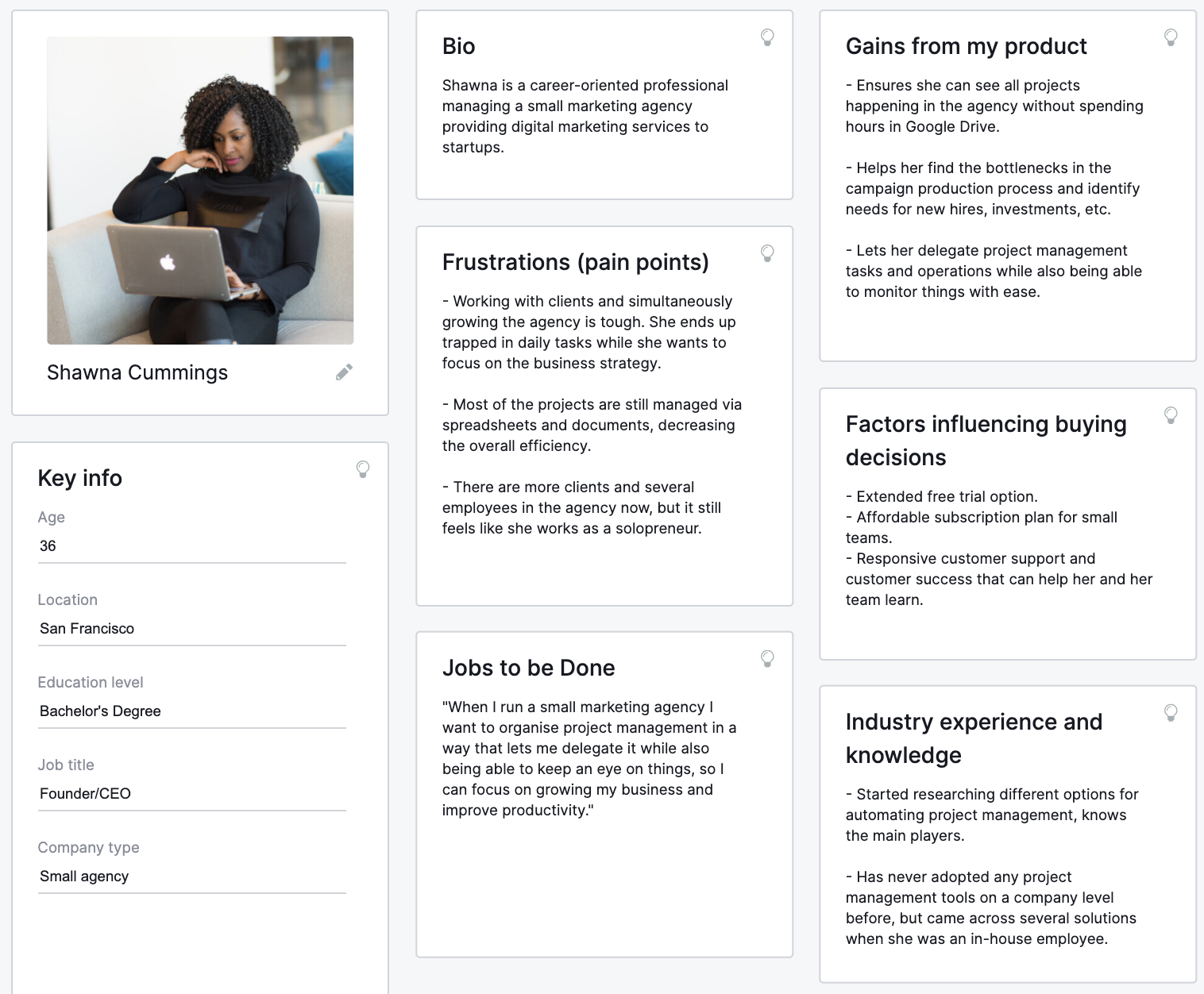
Your target market, segments, and overall audience research should be the main source of inspiration during every stage of landing page development. Using this information, you’ll be able to craft high-performing landing pages that appeal to specific personas, include effective messaging, and align with every visitor’s need.
2. Determine Landing Page Type
As discussed earlier, there are different types of landing pages, but which one do you choose? It’s important to start by evaluating your page’s goals.
Here are 5 questions to consider:
- What does your business want to achieve with this page?
- What step of the customer journey is the audience in?
- What are your visitors’ motivations?
- What is the page’s intent, and does it align with the searcher’s intent?
- What do you want the audience to do once they leave your landing page?
After defining the page’s goals, determine which type of landing page meets your needs. This decision helps inform what the CTA is and where it’s located, as well as page layout and overall design.
For example: Let’s say your target persona is not quite at the buying stage of their journey. The last thing you want to do in this scenario is shove a “Buy Now” CTA in their face. Instead, opt for a click-through or long-form sales landing page. These pages work to further educate and prime visitors on the reasons why they should move forward with your business.
3. Develop Page Layout
Landing page layout will differ from page to page and business to business. But, there are some structural elements that every high-performing landing page has. Let’s take a look:
Headline
The headline is the first line of copy and the first thing visitors see after arriving on your page. But while 8 out of 10 visitors read the headline, only 2 out of 10 go on to read the rest. So, it needs to clearly and quickly communicate the value of your business, product, or service to keep visitors interested.
Tip: Make sure to limit your headlines to 10 words or less, grab the reader’s attention, and communicate the gist of your offer.
Description or Subheadline
The description or subheadline is the smaller text copy that stays around the headline. These two elements are the dynamic duo of your landing page. While the headline grabs the reader’s attention, the description should convince them to stay. The subheadline gives you the opportunity to elaborate on your business’s unique selling point and persuades visitors to convert.
Tip: Convey your value, but keep it concise. It’s important that your headline and subheadline are working together. Don’t be afraid to move the subheadline around to develop a stronger, more compelling statement (i.e. above the headline, to the side, etc.).
Call-to-action
The CTA is the most important element of your landing page. In fact, your whole landing page is working to get the visitor to interact with this element. Landing page call-to-actions are usually a piece of text combined with an interactive component like a button or form. The CTA lets your audience know what you want them to do next. And when clicked, it generally marks the transition from visitor to customer.
Tip: Enlarge the call-to-action button and make it a contrasting color to stand out. Avoid the word “Submit” and instead use something more persuasive such as “Get Started.”
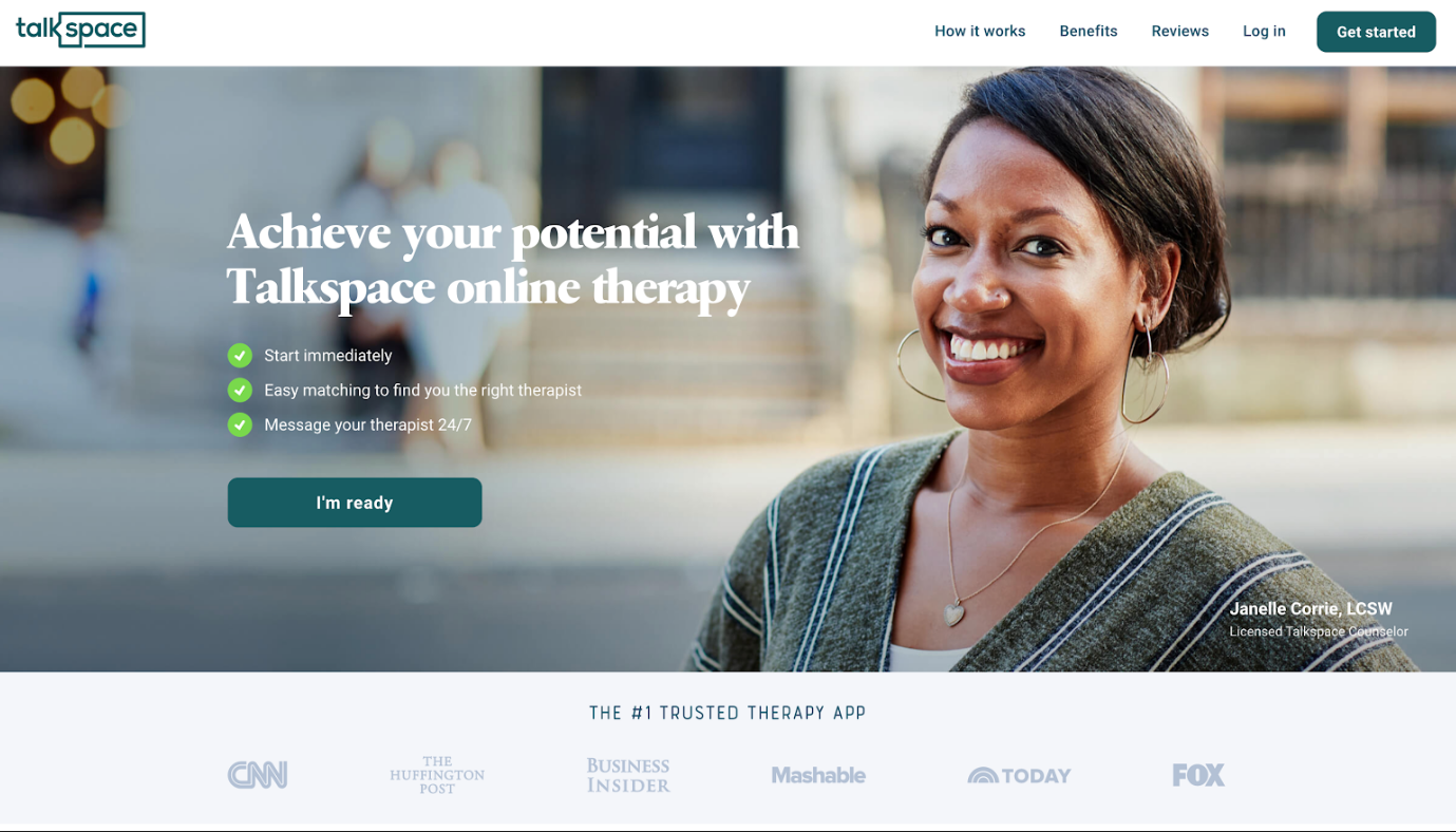
Here’s an example of a landing page that successfully uses these 3 essential elements.
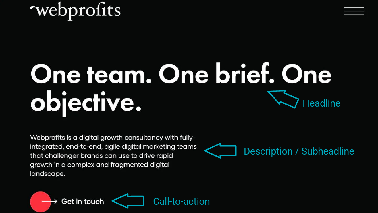
Now, there are two more optional elements that are not always necessary – imagery and additional page copy (more on these later). However, many landing pages use them. It all depends on the page type, brand identity, and page objective.
No matter how you design your layout, it’s important to consider what falls “above the fold.” This refers to the part of your landing page shown before the visitor scrolls. Since it receives the most attention from prospects, you must prioritize the copy and CTA accordingly. Everything above the fold needs to be important and of value to visitors. Otherwise, you’ll end up with high bounce rates and low conversions.
4. Include On-Brand Visual Aids and Design for UX
As you can see in the example pictured above, visual aids are not mandatory for a successful page. But, imagery can boost your page’s overall effectiveness. Since you must keep your headline and description brief, visuals help visitors quickly understand your message, value, offer, and brand identity. They can also convey the feeling or effect of your service.
Here are some things to keep in mind when including visual aids on your landing pages:
- Do not overwhelm the reader with images or graphics; opt for 1 to 2 visual elements.
- Use large and high-quality images.
- Include a video or animated graphics, when possible.
- Make sure visuals are on-brand and relevant to the landing page offer.
When developing the look and feel of your landing page, it’s important to design for user experience (UX). Structure, visuals, typography, color, content, buttons, navigation, functionality, and more all contribute to UX and work together to convert prospects. So, designing a page that is easy to navigate and delivers a positive experience is crucial.
Consider including:
- Colors that illustrate the functional and aesthetic characteristics of your product or service. It also helps highlight your offer, guide attention, and establish consistency across all your branding. Color is especially significant for CTAs, as it attracts the user’s eye and prompts them to click.
- Negative Space to give the visitor’s eye a break and keep them focused on your message. You avoid overwhelming the reader with information by including white or negative space. It also helps your important page elements stand out more.
- Interactive Elements like a CTA button entice visitors to click and convert.
- Directional Cues subtly direct the user’s attention toward where you want them to go. These include arrows, eye gazes, or Z-pattern layouts that influence the way your visitors navigate the page.
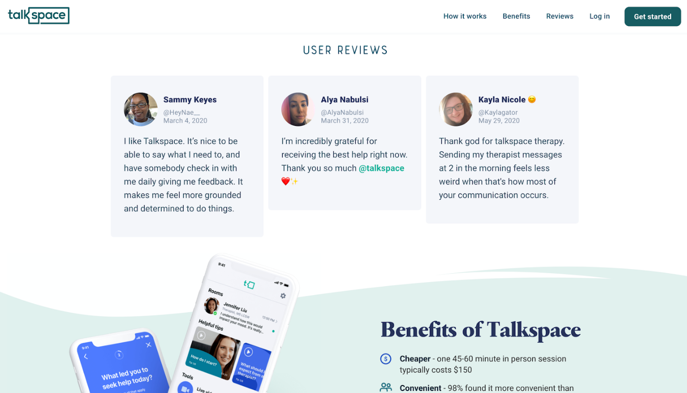
Here’s an example of effective use of visual and design elements:
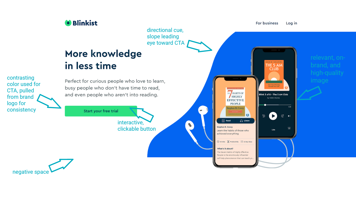
It’s completely up to you how you go about designing your page, so get creative. During the design process, pay attention to page speed and how your design or images affect it.
Page load time significantly impacts bounce rate. If your page takes up to 10 seconds to load, the bounce rate increases by 123%. So, it’s best to go with a more minimalist design. It is easier on the visitor’s eye and helps speed up your load time – leading to higher page performance.
5. Write Intentional Content
As discussed earlier, your copy above the fold (headline and description) should get straight to the point. But what about the content that falls below the fold?
While some landing pages only consist of a headline, description, and CTA, others allow users to scroll down to learn more about the business and why visitors should convert. This additional content should possess the same qualities as the above-the-fold copy – brief, value-driven, clear, and compelling.
When writing content, always keep your target audience in mind and be intentional with your copy. A landing page is not an explainer piece. The goal is to sell and convert visitors. So, every word holds weight and meaning. Don’t overwhelm your audience with too much information or too many CTAs. And avoid using jargon when possible. Remember to only include the information prospects need to convert.
This means:
- Benefits of using your service
- Key features of the product or service, as relevant to the target audience
- Pricing, promotions, or sales
- Free trial or demo, if applicable
Make sure to align your headline, description, CTA, and additional page content to reflect the user’s buying stage, pain points, and how you solve their problem. And make the content easily digestible for readers by breaking up blocks of text and producing skimmable copy (bullets, numbered lists).
The content should also establish your business as an authority and build trust between you and the consumer. You can achieve this by including data, statistics, and social proof (more on this soon).
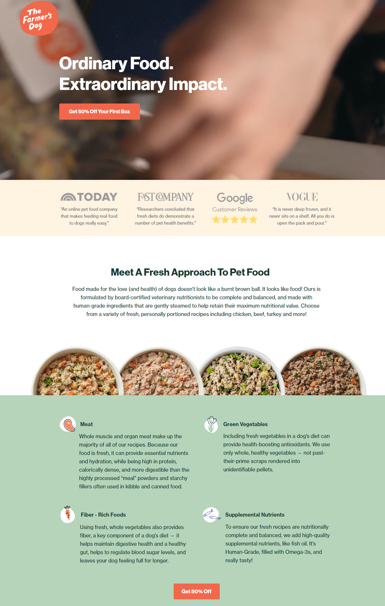
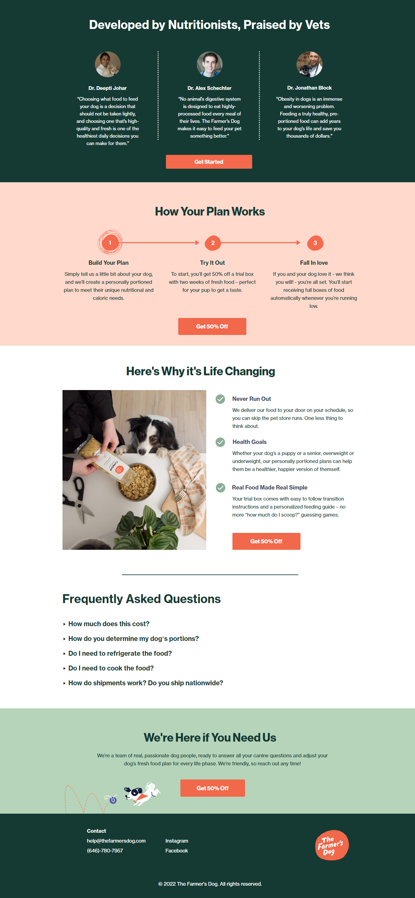
Here’s an example of a high-performing landing page with supporting content that builds trust, defines value, explains how it solves the visitor’s pain point, and delivers skimmable, compelling content.
6. Close the Deal with Supporting Information
Now, that you’ve got a targeted landing page with a killer layout, design, and copy – what’s left?
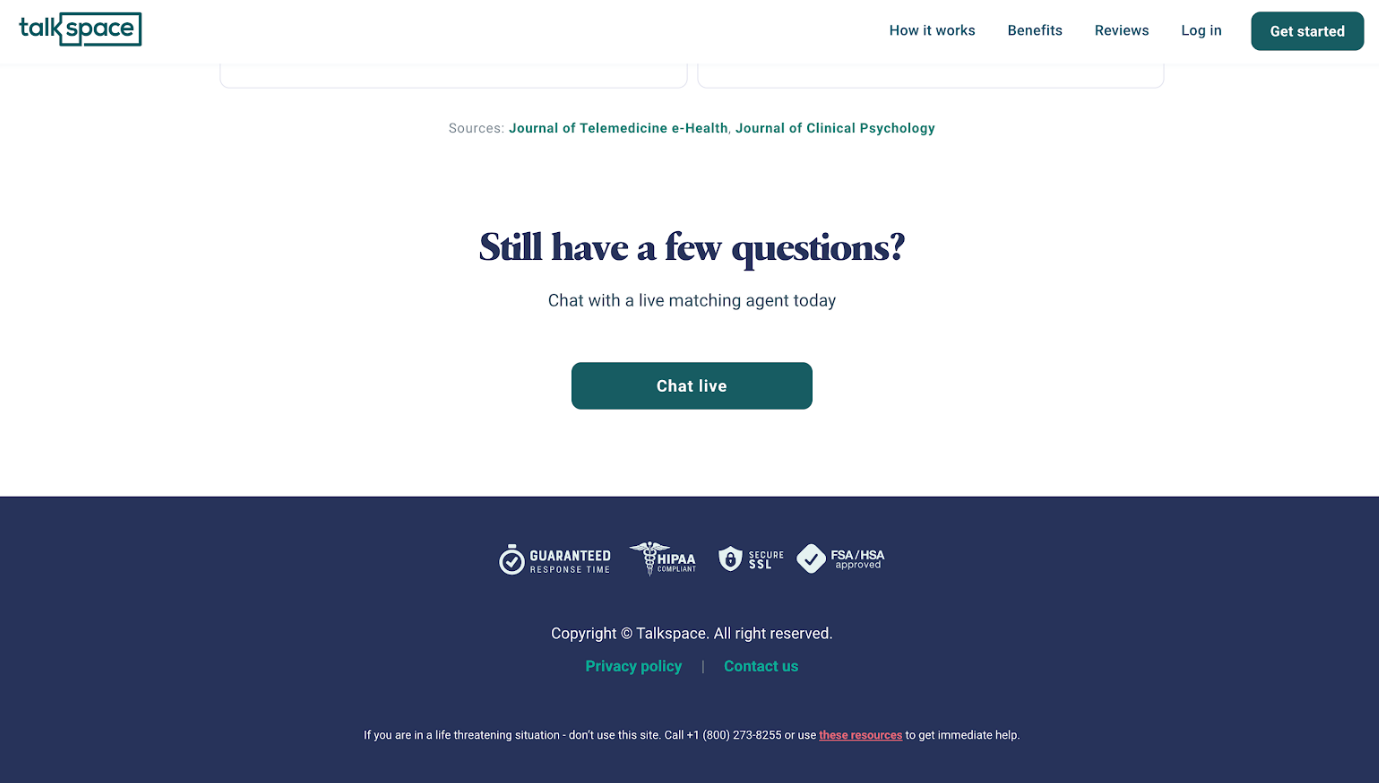
Answer: Social proof, contact information, and a FAQs section.
While these items typically fall further down the landing page, they work to ensure that your visitor has the best experience and ultimately converts. Let’s break these components down:
-
Social Proof
This term encompasses customer testimonials, case studies, reviews, badges, and so on. These elements work to establish your brand as reliable and showcase others who have benefited from your solution. Social proof validates your offer and effectively persuades the visitor to click your CTA.
-
Contact Information
It’s essential to provide methods of contact. At the most basic level, this communicates to the visitor that your business is legitimate. So, don’t forget to clearly display your local or international phone numbers, email addresses, locations, physical addresses, etc. Additionally, consider linking the business’ social media accounts. This way, the audience can browse through their favorite social media channels if they need to learn more about your business before converting.
-
FAQs
With a Frequently Asked Questions (FAQs) section, you can answer any other questions the visitor may have about your product or service. This entails cancellation policies, setup processes, and any other pertinent information. It’s also a great way to eliminate any objections the customer may have after reading through your landing page copy. Keep the FAQs out of the way (such as toward the bottom of the page) so they don’t distract users who are ready to convert.
Here’s an example of a high-performing landing page that utilizes social proof and contact information to build trust and legitimacy.
7. Analyze Metrics and Refresh Landing Pages
After you’ve created an effective, high-performing landing page, it’s important to routinely track your content’s performance and metrics. You can use analytic software such as Google Analytics, Ahrefs, Semrush, etc.
Consider keeping track of metrics like:
- Page visits or views
- Traffic source
- Conversion or submission rate
- Bounce rate
- Average time on page
- Form abandonment
You can easily see what’s working and what needs improving by monitoring your page’s performance. Then, simply make any necessary changes and refresh your landing page as needed. This way, you ensure that your team hits your desired benchmarks and stays on track to a high-performing page.
Wrapping Up
Landing pages are essential to any good content strategy. Whether your goal is to collect high-quality leads or drive conversions, an effective, high-performing landing page is a key to success. And while there is a lot that goes into creating a high-performing landing page, you’ll see results if you develop intentional and engaging content.
Author Bio

Kim Sayers has been a content creator for over 4 years – writing for small businesses, specifically focusing on marketing, sales, and communication. She works with telecom experts at Global Call Forwarding to gain insights into how businesses can use communication tools to run their businesses effectively.
