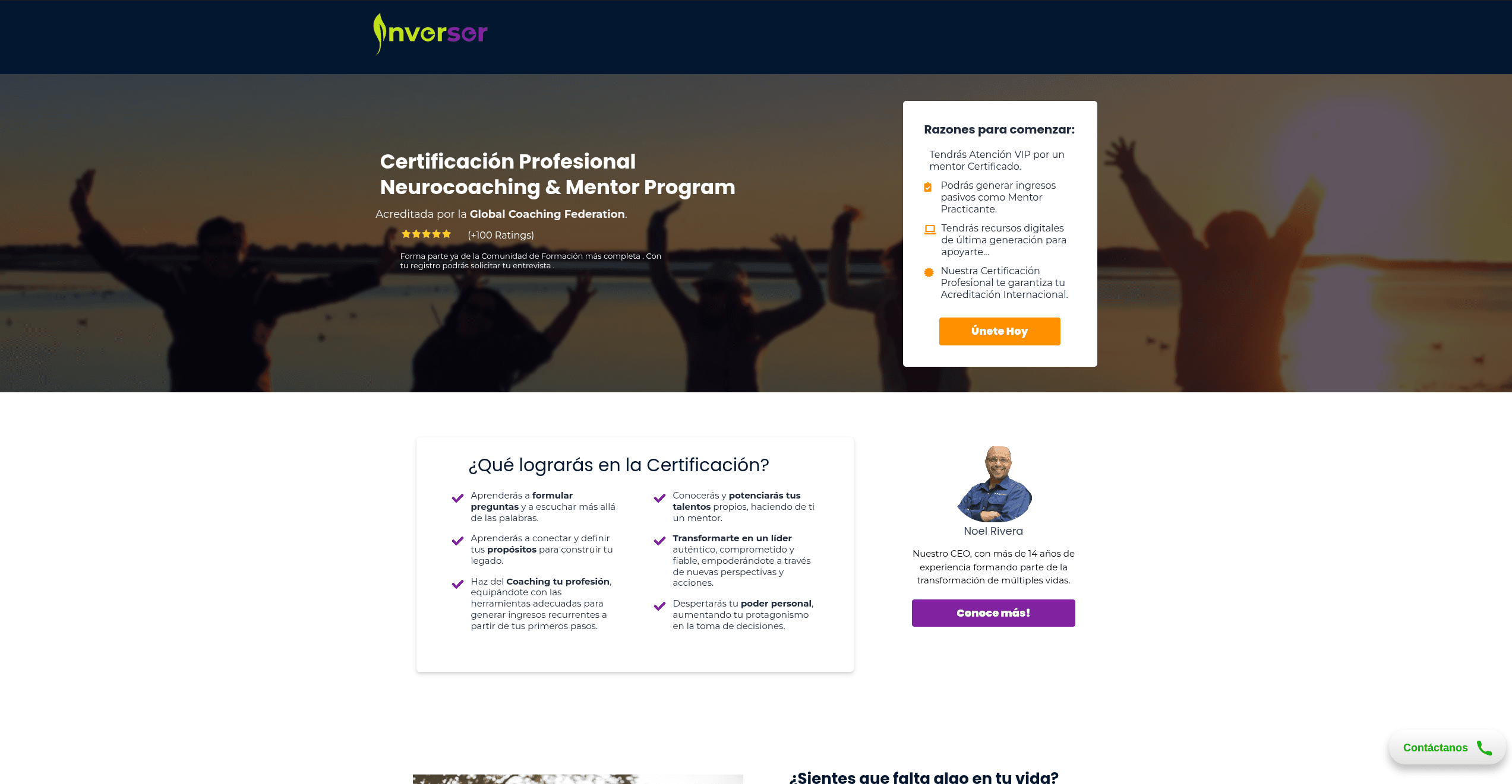
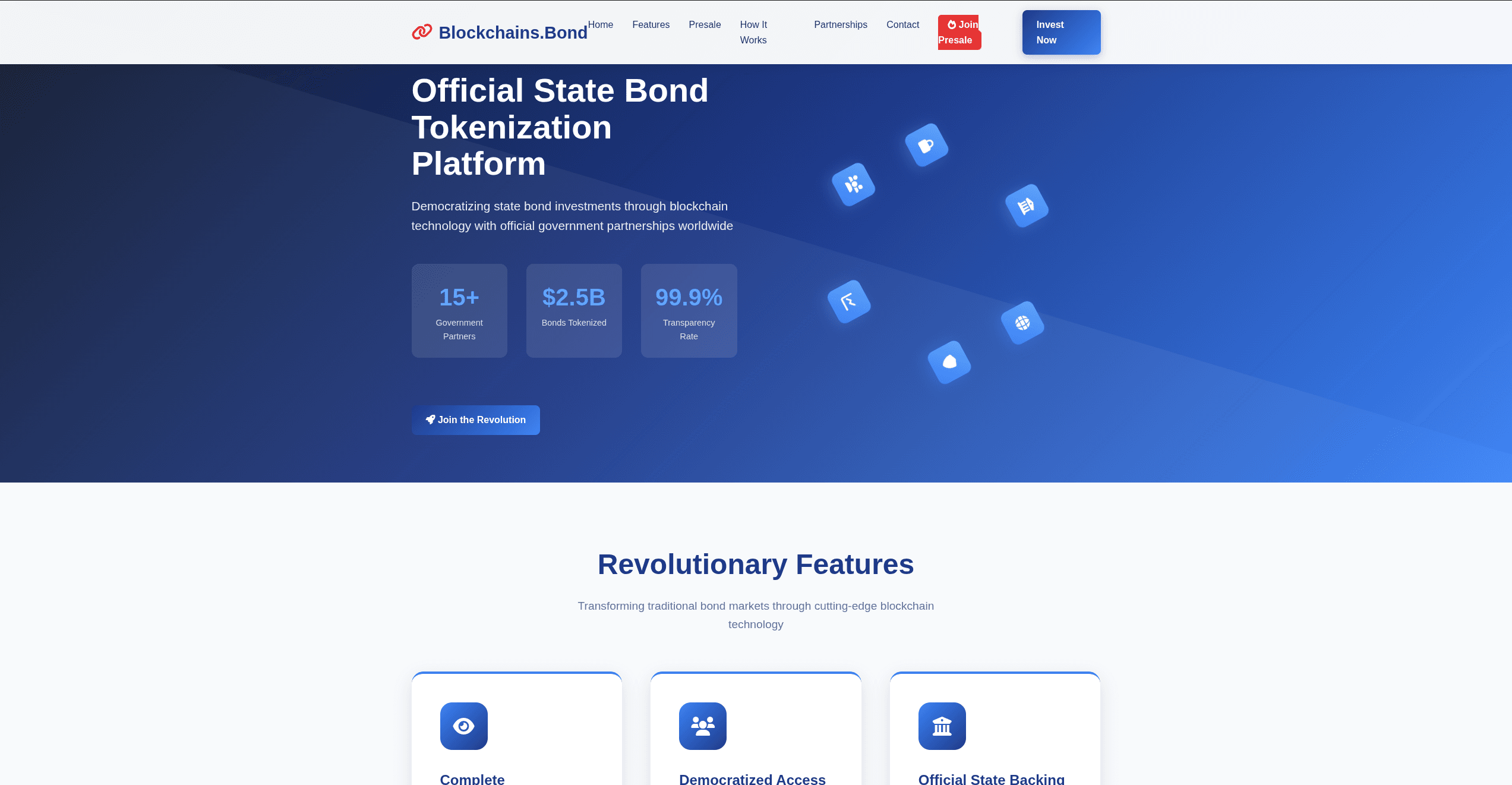
It’s not news that the best way to generate quality leads without setting up a full-fledged website is to have a landing page.
However, designing one is often a headache for beginner marketers who don’t know where to start and what to do. I have seen bloated landing pages, that don’t target a specific audience, have no compelling CTA, are not mobile responsive, and have complex and confusing designs.
All these are recipes to generate little or no leads, even as you spend more money on organic and paid traffic.
As an online business owner, I have designed many landing pages. Both for my business and for clients, and they all generate high-quality leads via organic or paid traffic.
In this guide, I showed you how to design a simple landing page that can generate leads. So there is no need to pay someone to do it for you.
What is a landing page?
A landing page is a one-page website designed for a specific purpose, which is to generate leads from visitors who land on it. While there are different types of landing pages, the goal is always the same – get more quality leads that can convert to sales.
It is important, especially if you want to sell more of your digital products. Consultants, coaches, or mentors who want to build digital brands and sell their services to a target audience also need it.
How to Design a Landing Page
Designing a simple landing page isn’t hard and doesn’t require being tech-savvy. Here are practical steps that will help you design one.
1. Define your Target Audience and Goal
The first three things you should ask yourself before designing a landing page are these:
Who is my target audience?
What do I want to achieve?
What steps does my target audience need to take for me to achieve my goal?
The rightful answers to these questions will guide you towards creating a landing page copy, lead magnet, and adding other important elements a simple landing page needs to generate quality leads.
Let’s assume you are designing a landing page for your upcoming webinar, where you want to teach people how to close multi-million dollar deals. Your target audience will be salespeople who work with established companies.
To get them to register for your webinar, you will compel them to click the CTA button and register for your webinar.
Based on my experience and what I have seen other marketers do, below are some popular CTAs that convert visitors to leads:
Register for a free webinar
Download your free e-book
Sign up for a free trial
Grab your coupon
Subscribe to a newsletter
Speak to a personal injury for free
Avoid the mistake of focusing on more than one goal on your landing page. This is for you to create a landing page that solves one issue. And for your visitors to feel they are in the right place when they land on the page, and also for them to engage and take a desired action.
2. Choose a Suitable Landing Page Builder
After identifying your target audience and setting a clear goal, the next thing to do is choose a suitable landing page builder.
Some people recommend popular content management systems like Wix, WordPress, Hubspot, and Joomla. I prefer dedicated landing page builders like Leadpage, Unbound, Elementor, OptimizePress, Carrd, and Swipe pages.
Content management systems like WordPress are free but lack the advanced features you need to build an intuitive landing page.
Dedicated landing pages like Leadpage are expensive, but offer advanced features.
Just like their name sounds, they are created to build landing pages. You don’t need to write a single line of code. Everything you need to build your simple landing page is included in it. There are plenty of pre-made templates, and they also support integration with third-party marketing tools.
I have used Leadpages to design landing pages and the features are awesome. For example, it offers plenty of pre-made templates for any type of landing page you want to design. Also, it supports integration with your favorite tools like Google Analytics, Shopify, Convertkit, Live Chat, Google Sheets, and other marketing tools an everyday marketer uses.
3. Choose and Customize a Template
Since we are talking about a simple landing page, just choose a template from the pre-made ones your landing page builder offers and customize it to suit your needs. The basic things to consider are fonts, color, visuals, and layouts and be sure they suit your brand.
Below are some tips that can help you with customization.
Go for large images that are typically under the website header. This shows your visitors what you offer and can be a hook to keep them engaged.
Replace the image with a product image. A photo of people using your product or service is suitable, as it makes it easier for visitors to connect with the message of your landing page.
If you can’t get a product image, a stock image will do, provided it shows what your visitors will gain if they click the CTA button and take action.
Use the color palette to strike a balance and make your design an interesting one. A mix of bright colors and muted tones will make sense.
Use only valuable images and optimize them to avoid bloated pages that take forever to load.
4. Write a Compelling Landing Page Copy
This is where your creativity comes into play. Your aim here is to convince the visitor to take action. Some marketers hire copywriters for it. No worries if you don’t have the budget. You can achieve the same results if you follow these steps.
The first step to writing a compelling copy is to structure it. Have your headline, tagline, actual copy, visuals, and CTA.
Your headline and first visual serve as a hook. If they don’t impress your visitor, next they hit the back button.
Let your copy be simple, clear, and concise, and guide your visitor towards taking the desired action.
Let your tone speak to them directly by using“ you” or “yours” in your copy.
You can also try AI copywriting tools. We have plenty of them nowadays that write landing page copy. Feed them the correct prompt and use their output as a guide.
5. Add an Enticing Call-to-action
Adding an enticing CTA is the next thing after telling your visitors how your product or service can solve their problems far better than your competitors.
Your call-to-action is the most essential element of your landing page, and you must make it stand out. The idea here is to persuade your visitors to take a desired action that leads to achieving the goal of your landing page.
CTA is usually a click-through button that is visible on the page. This means you should use colors and text and make it clear, and unique and also complement other elements. The text on it should be simple, and straightforward, and explain to your audience the action you want them to take. Action verbs like“ register now”, “download for free”, “contact us”, or “book a session” are common CTAs.
Where you add your CTA matters a lot. Why it isn’t okay to add it first at the top of your landing page to avoid sounding salesy, I don’t recommend adding it at the bottom. This is because not every visitor will engage till the last sentence. An average page user scrolls and may not reach the end of the page before exiting. The best place to first add your CTA is at the middle of the page, immediately after your actual copy, and before testimonials and other elements to build trust. A visitor who lands on the page and engages for 30 seconds will see it.
6. Add a form
Your CTA button should take your visitors to a new page where you capture them as leads. Let’s assume you generate leads for your webinar.
Link your webinar registration page to the CTA button so that when your visitor clicks on it, they will be redirected to the page and register. That’s it, you have generated a lead.
It’s important you know the information you want to collect from your lead. If a first name and email address are enough, don’t ask for a home address or phone number.
Hubspot surveyed marketers and advertisers in the United States to learn about landing page trends. 30.7% of the respondents said that the ideal number of questions on the landing page form is four if you want to boost conversion rate.
What does it tell you? People are likely to abandon your landing page form if they think it has irrelevant questions.
7. Preview and Test
At this stage, you are ready to launch it. But before that, preview it on various devices to see if it responds well. Many of your visitors will land on your page using mobile devices, and it’s a turn-off if it looks messy.
Fix all grammatical errors in your copy, check if images are placed correctly, and confirm if all links load properly.
Test your CTA button and lead form to confirm that any filled form reports in your CRM or email marketing platform.
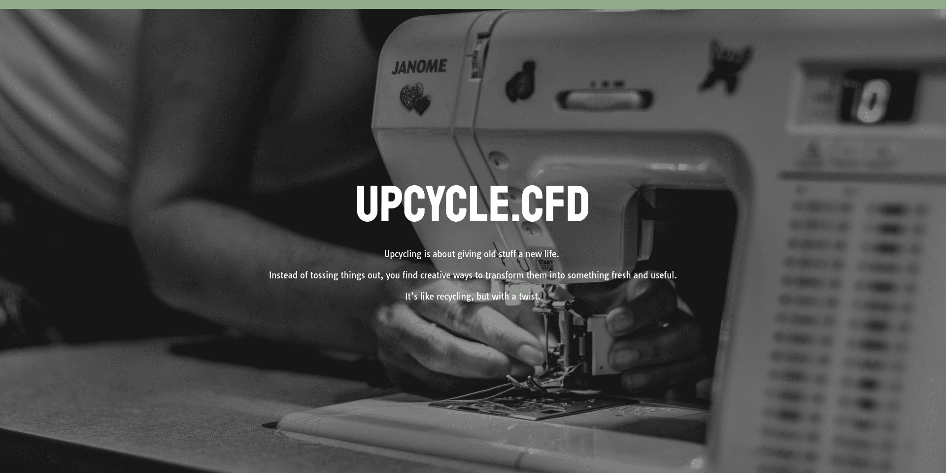
Hit the publish button if everything looks good. Next is to connect it to a domain to make it live. You can even brand it by using domain extensions like the ones ShortDot offers.
8. Track and Optimize
Once your landing page is live, and you begin to drive traffic to it, track performance to see what is working and where you need to make adjustments. CTA, headline, visuals, and forms are key elements you should track and optimize using A/B testing.
Summary
With these steps, you can see that designing a landing page that can convert is easy. No need to hire someone. You can do it yourself within 1 hour provided you have identified your goal and target audience, your copy is ready, and you have chosen a landing page builder.
Author bio:
Chuks Chukwuemeka is a freelance SEO for SaaS brands. He loves writing articles on digital marketing and learning new things about SEO. Connect with him on LinkedIn.